
I've been reading a lot lately about how to market products online. The photography piece cannot be ignored. Potential customers will reject your lovely handmade item in less than a second if your photo looks like crap. Sorry to be so blunt, but that's a fact. You're probably guilty of product rejection based on photography yourself. If you are an Etsy shopper, I guarantee your eyes have quickly flipped past a given product because the photo looks amateur, messy, sloppy, you fill in the adjective.
I'm going to walk you through how I've set up a simple way to get better shots of my dolls and doll clothing since I'm branching out into selling doll clothes on Etsy in the new year.
First, I'll show you a really bad photo, but one similar to what you might run across on Etsy. If you find one like this on Etsy, click through to the listing and look at how many sales the shop has had. I'll venture to guess not many. Of course you also have to take into consideration when the shop opened.
OK.....the first photo here was snapped late at night on the table in my craft room. Flash photography, cluttered background, artificial lighting. NOT what you'd want to use as your listing photo on Ebay or Etsy for sure. It's a total "deer in the headlights" look and doesn't show off how beautiful this doll is. Nor does it do anything to highlight the outfit I'm trying to sell.

The next two photos were taken the following morning using natural light and a few other little devices that made for much better photos. Read on to see what I did. In the first photo I used a "toy camera" setting on my Canon PowerShot which darkened the edges. I think this is a cool effect and I liked this photo. MUCH better than the one above.

In the photo below, I used a "vivid colors" setting on my Canon PowerShot. Otherwise everything else is the same as the above photo. I shut off the flash for both photos and used only natural lighting. I REALLY like this photo. I think the colors are just so bright and I think the coloring on Ellyn's face is prettier and more natural too. This is probably what I'll use for a listing photo. Read on to find out how I got these shots.

For my photo shoot, I propped a piece of white foam core against a chair and placed a piece of white tagboard underneath. I strategically placed this in front of a large window to receive the maximum amount of natural lighting. I didn't even need to remove the race car in the foreground. Just keepin' it real!!

The next two close-ups were taken using the vivid color setting on the Canon PowerShot. Again, no flash photography was used.


This third photo was taken with the Portrait setting on the PowerShot, I think. Still a decent photo, but the colors aren't as bright. I also didn't really pay much attention to Ellyn's hair and it's partially covering her blouse, which I wouldn't want in a listing photo. The customer should be able to easily see the details of the product.


I was determined to get a good shot with good contrast, so I looked around and my eyes landed on this set of canvases that are on the wall in my studio. I took down the red one to use as a background.

Below you can see that I just propped the canvas in front of the white foam core and sat Ellyn in front of it. It's amazing what a difference a camera setting makes, isn't it? The above photo was shot with the "vivid color" setting and the one below with the "portrait" setting. It looks like two different canvases!

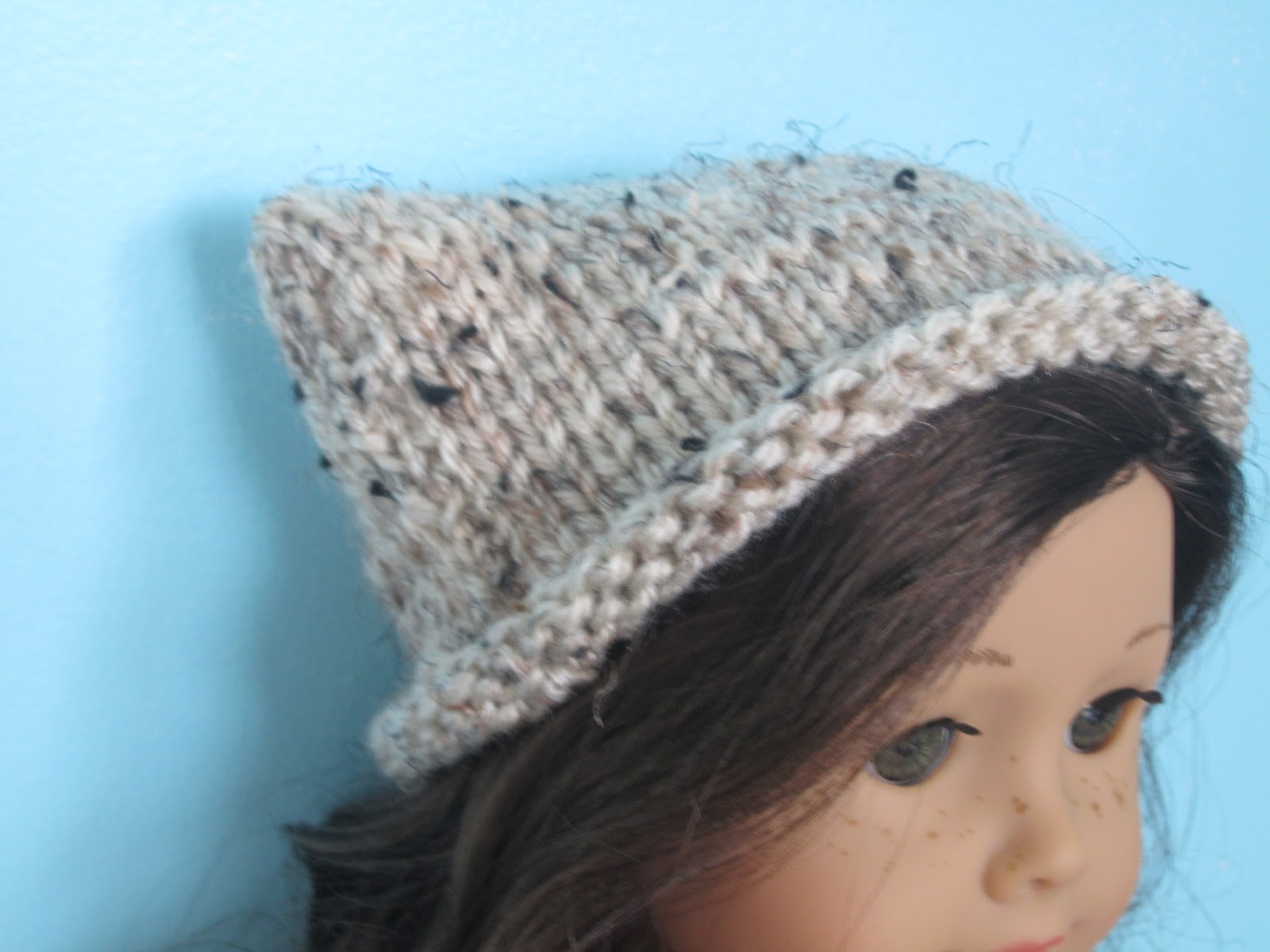
The photo below shows the shot I got against the canvas background. I'm not completely enamored with this shot, but I do think the hat shows up nicely on the red background.

For fun, I decided to try a shot using the monochrome setting on my PowerShot. I actually really like this photo. I think it really makes the hat stand out. I wouldn't use this as the only photo in an online listing, but I sure would consider using it as one of the photos.

Hopefully this post has given you some ideas about what you can do to improve your product photography. If you take the time to make a few simple changes, your photos will get better and better!!
No comments:
Post a Comment